Labels round 2
 Since last week's entry on critter labels I have become a bit obsessed with taking pictures of bottles and cropping them just right to get rid of any giveaway words. It's undoubtedly because I'm the kind of person whose choices of wine and beer are too much influenced by label design that I have become fascinated by what these things look like. I know enough about my beverages to be able to tell the difference between porter and pilsner, Cabernet and Chardonnay, but I don't speak the language fluently. So even though I know I'm supposed to hate cutesy shit that looks like the product of a corporate marketing department or a focus group study, I'm pretty easily taken in by the same clever tricks that get me to buy "vintage" Polo shirts at Old Navy and Choxie chocolate at Target. I like consumer products that say to me, mzn, this is just the kind of thing a person with your good taste would like, but that say it without seeming to be selling class distinction, without snob appeal. It's all about making the consumer feel comfortable and smart, and neither intimidated nor self-conscious. It bothers me, but only a little, that my resistance to this is quite weak.
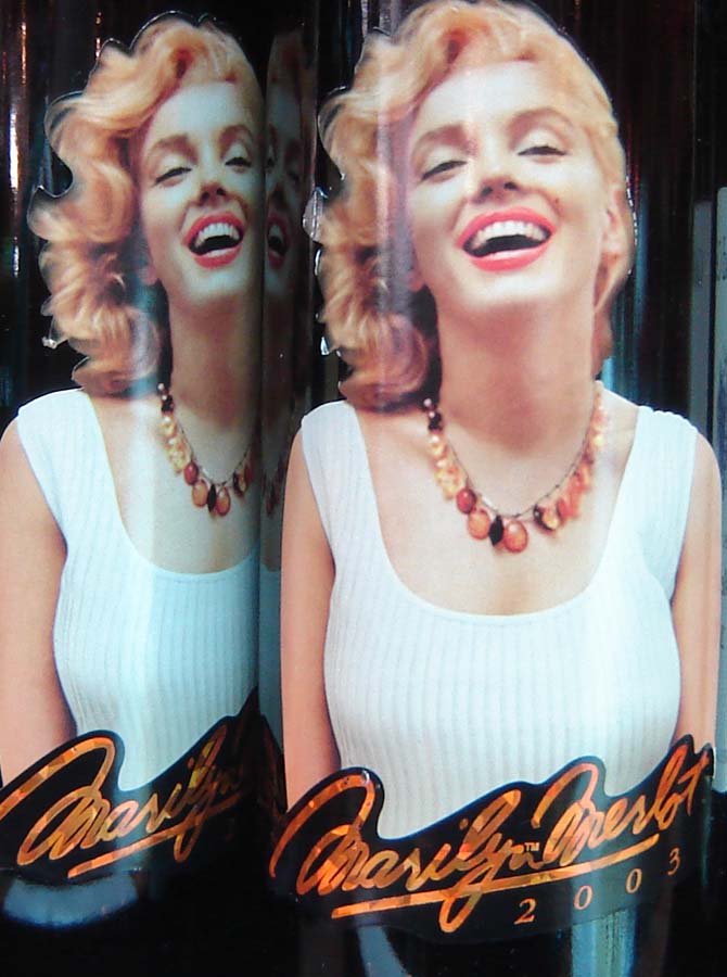
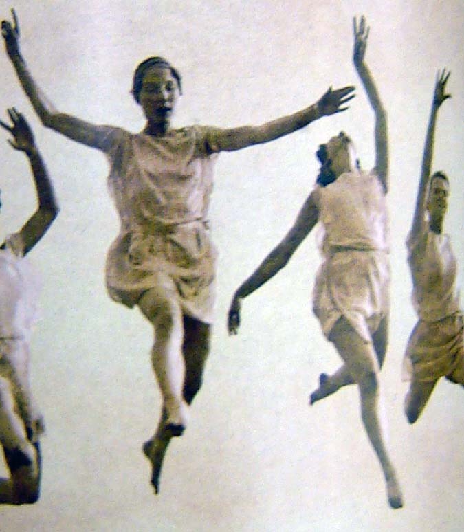
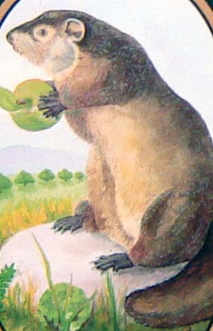
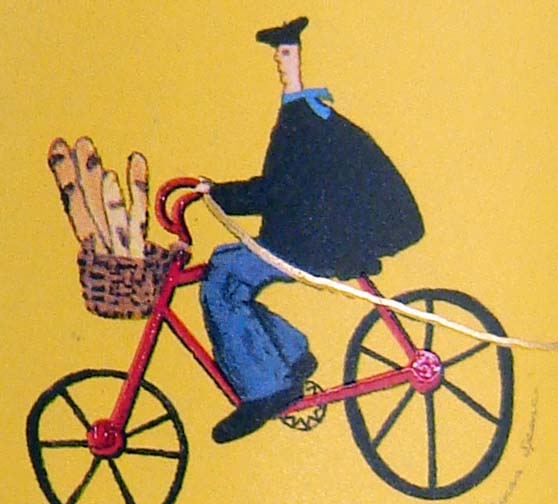
 Part deux includes both alcoholic and non-alcoholic beverages (including beer, wine, and fancy soda) but no spirits. You've probably seen the C mascot more often than any of the others. I don't know if this helps you at all, but I took most of these pictures at a Cost Plus World Market store. Answer or just guess in the comments. Or bitch about consumer capitalism!
A.
B.

C.

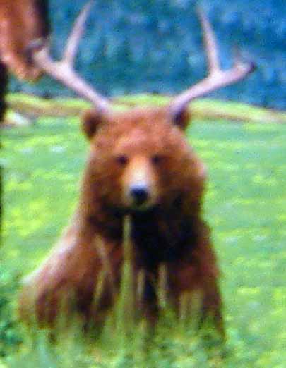
D.

E.
F.

G.

H.
I.
posted by mzn at 2:34 PM
![]()


0 Comments:
Post a Comment
<< Home